The story has two aesthetics
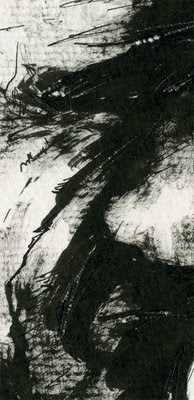
The story has two aesthetics. One is acrylic and that one works great. I just have to worry that the figures have a lot of movement and exaggerate the action. The other, the bulk of the narration, uses Indian ink with a pen and gouache with that ink. When I completed a kind of four-page sequence, I saw that the result didn’t quite work. It was all very «well drawn«. I was losing strength. It wasn’t loose. It was very important to make the decision to repeat the vignettes until you came up with something. I suppose that if you drag things that you don’t like and you get carried away, there comes a time, with a lot of work done, that you get tired of doing things that are not convincing you. Being demanding on this point and with everything is absolutely necessary. By repeating it several times, I have come to something. The ink has worked on its own and is allowing me not to use the gouache to enhance the shadows. The result highlights the lighting of each scene. It takes it more into chiaroscuro, so to speak. Creating shadows with India ink, when the brush is almost dry, greatly enriches the drawing. At the end with the nib, I add a little noise as scratches and scraping the paper I take out some light and put more noise. I try not to let the stains end abruptly.
The result is that the forms are disappearing. Contours cease to exist and incoherent spots interpret the effects of light on faces. It’s getting a little gloomy. Very strongly. The story doesn’t really do badly.

