Man Puzzle Corrections
Puzzle Man
Error analysis

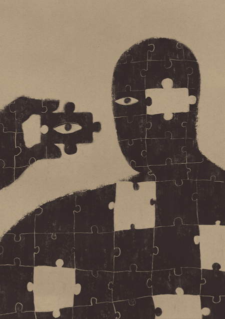
I made this image in support of a text from the series Information and Poetry in which I talk about the need to build a personal discourse. A theory that helps you be consistent with what you do.
This is the first blog post to discuss the evolution of image corrections. I'm very impatient. I work very obsessively and when I think I'm done, I immediately want to publish the result. I think it's one of the biggest mistakes in the way I work. One of the things I've set out to do is to improve the final finishes of the illustrations I make.

After a couple of days, I recognized to myself that there was room for improvement. There were several aspects that did not convince me.
The first thing was the eyes. I didn't like them. White is too aggressive and although it is true that they focus attention and help to understand the general concept, it seems to me that they have too much light and take too much prominence.
The second thing is that the lines that mark the puzzle seem too linear to me. They generate a structure that is too parallel to each other. That gives too much stiffness and causes you to lose a bit of rhythm.
The third and most serious thing is that there is a spelling mistake. By that I mean that the puzzle piece in the eye touches the face. There is no separation between them. That's like having a misspelled word. In an illustration with such simple concepts, the "words" have to be well written. The puzzle piece has to be recognized. Have your space. There is no need for the elements to stick to each other.

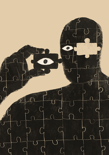
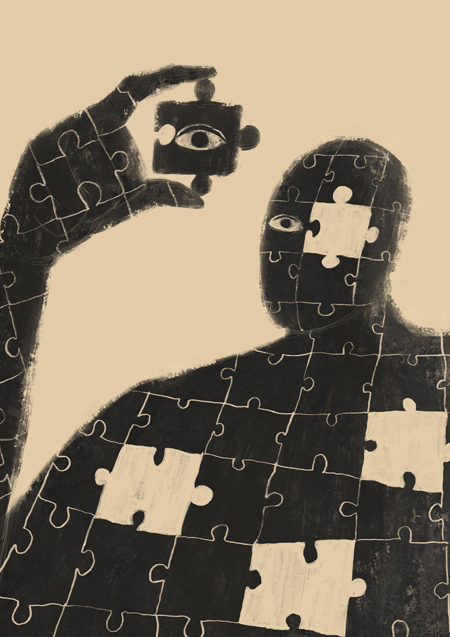
So I decided to do another version. This:
But the same thing has happened to me. When I saw it after two days, the result was not what I wanted either. The lines, make it more rhythmic now. But too much. The hand has the puzzle lines in a different perspective and I think it adds a lot of noise to the illustration. It is a noise that is also not necessary, because it does not contribute anything to the information. It reinforces the concept that it is the person himself who is being assembled, but in the previous illustration it was already understood.
In terms of information, I add things I don't want and lose the feeling of rigidity that didn't work so badly. The new recesses do work well.
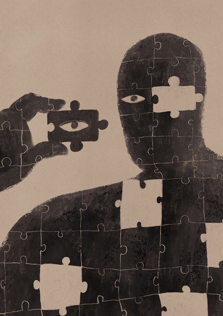
So I've built a new version which is this: In it I try to combine the good of both. It hasn't even been ten minutes since I've finished it, so I guess I'll change it. If this post ends here, it's because I'm happy with it. 😉

Soporte
¿Quieres apoyar los contenidos de esta página?
